
What is Data Visualisation?

Imagine walking into a meeting where everyone is silently staring at a massive spreadsheet, thousands of numbers, no clarity, and absolutely no idea where to begin. The confusion is almost palpable.
Then someone clicks a button and in an instant, those overwhelming numbers transform into a clean, simple visual. A chart that tells the story the spreadsheet never could.
Suddenly, the room comes alive, people understand the trend, the issue, and what needs to happen next.
That’s the real power of data visualization, and in today’s world, showing the data in the right way matters more than ever.
What is Data Visualisation?
Data visualisation turns information and data into visual elements like charts, graphs, maps, and infographics. It does more than just convert numbers into pictures. The process transforms complex data sets into visual stories that reveal valuable insights. Modern tools and techniques create dynamic, interactive visuals that bring hidden patterns to life.
Why Data Visualisation Is the Need of the Hour?
Data is growing faster than humans can process, and decisions need to be made quicker than ever. Spreadsheets slow teams down, visuals speed them up.
Data visualisation turns overwhelming information into clear, instant insights. It helps teams spot patterns, understand problems, and act with confidence instead of guesswork.
Because in this fast-paced world, it’s not just about presenting data.
It’s about making smarter decisions, faster.
Benefits of Data Visualisation
1. Turns Complex Data Into Clear Insights
Visuals make patterns, trends, and relationships instantly understandable, reducing time spent analyzing raw numbers.
2. Enhances Decision-Making
Dashboards provide real-time insights, enabling faster and more informed business decisions.
3. Improves Communication Across Teams
Clear visuals make it easier for non-technical stakeholders to understand data-based narratives.
4. Identifies Patterns, Trends, and Anomalies
Visualization helps teams detect opportunities, risks, and irregularities that might go unnoticed in spreadsheets.
5. Boosts Productivity & Efficiency
Automated reports replace manual data processing, saving hours of repetitive work.
Use Cases of Data visualisation across industries
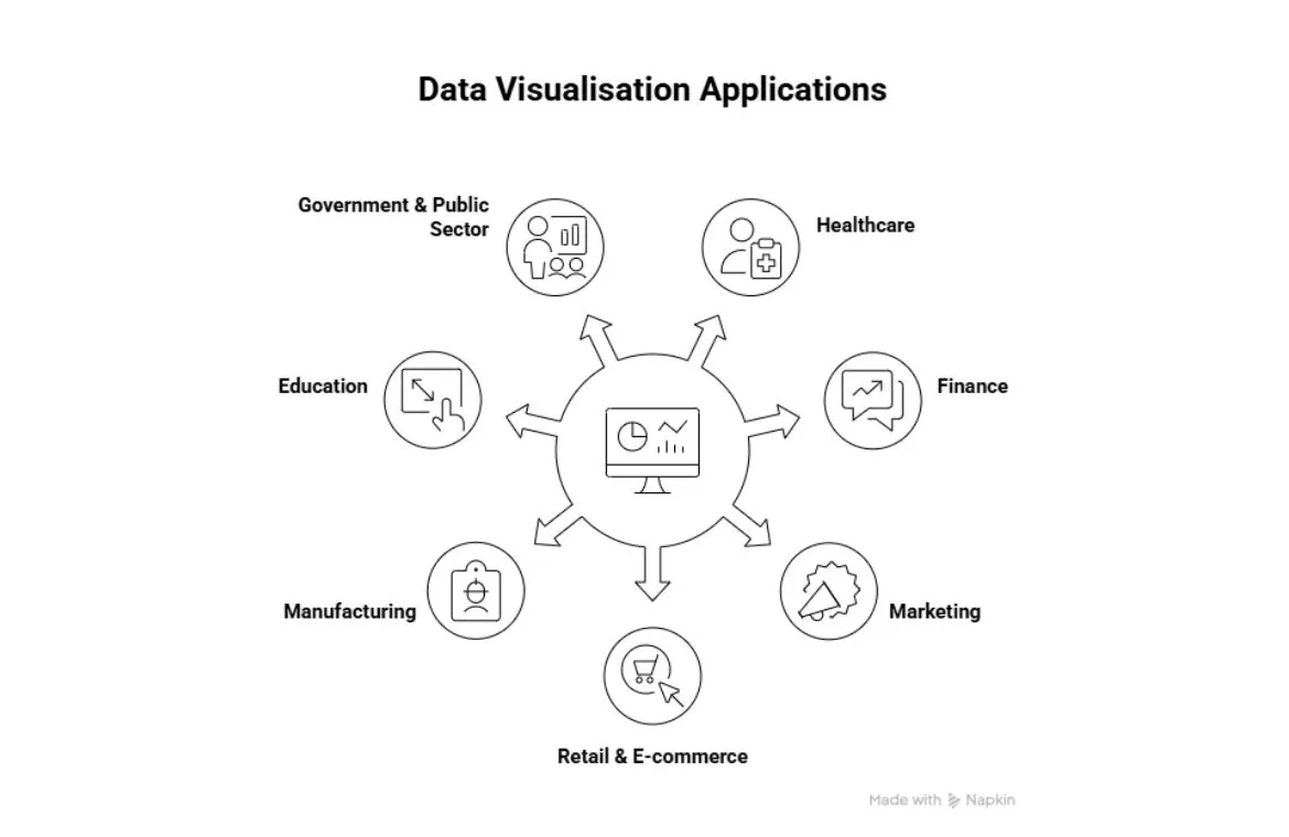
Data visualisation changes how organisations of all sizes interpret information to make strategic decisions. Converting raw numbers into visual formats creates benefits that spread throughout different industries.
- Healthcare
It is used for tracking patient outcomes, analyzing treatment effectiveness, and monitoring hospital operations to enhance care quality.
- Finance
It supports risk management, fraud detection, portfolio monitoring, and real-time market analysis for stronger financial decisions.
- Marketing
Helps teams monitor campaign performance, understand customer journeys, and refine targeting based on real-time insights.
- Retail & E-commerce
It is used for sales forecasting, supply chain optimization, and analysing buyer behavior to improve product strategies and customer experience.
- Manufacturing
It Visualizes production metrics, machine performance, and quality indicators to reduce downtime and streamline operations.
- Education
It helps to track student progress, analyze attendance and performance trends, and support academic planning.
- Government & Public Sector
It is used for public data reporting, population statistics, budget analysis, and policy performance tracking.
Types of Data Visualisation
Different visualisation types serve distinct purposes. Data professionals can present information in ways that best show patterns and insights.
1. Basic Charts and Graphs
These are the visuals you see everywhere, simple, clear, and perfect for quick insights.
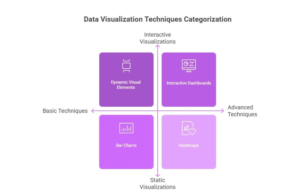
• Bar Charts
Bar charts use rectangular bars to represent values across categories. They are effective for comparing discrete groups and identifying which categories dominate, lag, or remain stable over time.
• Line Charts
Line charts connect individual data points through a continuous line. They are ideal for understanding patterns, trends, movements, or fluctuations over a defined timeline.
• Pie & Donut Charts
These circular charts divide a whole into proportional slices. They highlight how different segments contribute to a total, helping users assess distribution at a glance.
• Histogram
A histogram organizes continuous data into intervals or “bins.” It’s used to understand data distribution, concentration levels, and frequency patterns.
2. Advanced Charts
These techniques reveal deeper patterns, correlations, and outliers within datasets.
• Scatter Plots
Scatter plots display data points based on two numerical variables. They help uncover relationships, clusters, or deviations that may not be visible in simple charts.
• Heatmaps
Heatmaps use color gradients to show data intensity. They make it easy to spot high, medium, and low-value regions, especially in large matrix-style datasets.
• Box Plots
Box plots display the distribution, median, quartiles, and possible outliers of a dataset. They are used to assess variability and data spread with precision.
• Waterfall Charts
Waterfall charts visualize how incremental positive or negative values lead to a final cumulative result. They provide clarity in breakdowns of financial or operational changes.
3. Geospatial Visuals
These techniques integrate data with geographical locations to reveal regional patterns like: maps.
• Choropleth Maps
These maps use shaded color blocks to represent data values across regions. They help identify geographical differences and area-based trends.
• Geo-Point Mapping
This technique places markers at precise geographical coordinates. It is useful for visualizing density, distribution, and location-specific metrics.
4. Multi-Dimensional Visualizations
Ideal for complex datasets with several variables.
• Radar Charts
Radar charts map variables on multiple axes radiating from a central point. They help compare multi-faceted performance indicators in a compact form.
• Bubble Charts
Bubble charts add another dimension to standard scatter plots through bubble sizes. They help interpret three variables simultaneously in a single visual.
5. Interactive Visualizations & Dashboards
These allow users to filter, drill down, and manipulate data dynamically.
• Interactive Dashboards
Dashboards combine various visualization components, charts, filters, KPIs, and maps, into a unified interface. They offer real-time insights and help decision-makers explore data from multiple angles.
• Dynamic Visual Elements
These include sliders, hover effects, drop-downs, and tooltips that make data exploration more intuitive and user-driven.
6. Infographic & Storytelling Visualizations
These blend design, narrative, and data to present insights in a highly digestible format.
• Infographic Charts
These incorporate icons, timelines, labels, and thematic visuals. They focus on communicating insights clearly while maintaining aesthetic appeal.
7. Emerging & Next-Generation Visualizations
Modern tools introduce advanced techniques to understand highly complex datasets.
• 3D Visualizations
These add depth and spatial representation to data, making it possible to analyze multilayered relationships that 2D visuals may not capture.
• AR/VR Data Visuals
Augmented and virtual reality turn data into immersive experiences, enabling users to engage with information through spatial environments.
Tools for Data Visualisations
The right data visualisation tools can significantly affect how you extract and share insights.
1. Microsoft Power BI
A leading business intelligence tool used across industries for interactive dashboards and automated insights.
2. Tableau
It is Known for its rich visuals and powerful data exploration features.
and it is highly interactive dashboards, strong performance with large datasets, and ideal for analytics teams.
3. Google Looker Studio (formerly Data Studio)
A free, web-based tool widely used for marketing and web analytics reporting.
it provided simple interface, seamless integration with Google products, and easy sharing of live dashboards.
4. Excel & Google Sheets
It is still the most accessible tools for quick data visualization and basic analysis.
It provided universal availability, familiar interface, and ideal for small datasets or quick reporting.
5. Python Libraries (Matplotlib, Seaborn, Plotly)
Used by data scientists and analysts for advanced, customizable visualizations.
it has High flexibility, strong analytical capabilities, and suitability for machine learning workflows.
Challenges of Data Visualisation
1. Misleading or Misinterpreted Visuals
Data visuals can create confusion when the wrong chart type or scaling is used. Truncated axes, exaggerated effects, or unnecessary 3D elements can distort the message and lead to wrong conclusions.
2. Data Overload and Visual Clutter
People absorb massive amounts of information every day, almost like watching movies non-stop. This constant overload creates challenges for organisations, including:
- Decisions slow down because important details get buried
- Key patterns, risks, or opportunities going unnoticed
- Teams repeating work because data is stored in separate systems
3. Ethics and Bias in Visualisation
Visualisations often appear objective, but they are still created by people. Choices in color, scale, framing, and data selection can introduce bias, intentionally or unintentionally. Ensuring fairness, clarity, and transparency is essential.
The Future of Data Visualisation
1. AI-Powered Insights and Automation
Organisations increasingly rely on AI-driven tools that analyse complex data instantly and generate visualisations automatically. These tools help users uncover insights without deep technical skills.
2. Automated Data Storytelling
Future platforms will not just show charts, they will explain insights, highlight trends, and provide context automatically, reducing the need for manual analysis.
3. Real-Time Dashboards and Live Analytics
Dashboards are becoming more dynamic, updating instantly as new data flows in. This supports faster, more accurate decision-making.
4. Better Accuracy and Control in AI Tools
As AI becomes more involved, ensuring visualisations remain accurate, clear, and free from errors or “hallucinations” will be a key priority for organisations.
Conclusion
In today’s data-heavy world, organisations don’t win by collecting more information; they win by making it understandable. Data visualisation transforms complexity into clarity, helping leaders make better decisions in less time.
It’s not just a tool for analysts anymore. From managers tracking performance to marketers understanding user behaviour, data visualisation empowers everyone to think visually, communicate clearly, and act with confidence.
As the saying goes, “Data is the new oil, but only if you can refine it.”
And visualisation is that refinery.
So, Businesses that embrace it don’t just see their data; they understand it.
And in the era of AI and fast decision cycles, clarity is not a luxury; it’s a competitive advantage.
Also Read: Understanding Data Science: The What, Why, and How?
Frequently Asked Questions
Q1. What exactly is data visualisation?
Data visualisation is the process of representing information graphically through charts, graphs, maps, and other visual elements. It transforms complex datasets into easily understandable visual formats, enabling quicker insights and more effective communication of data-driven stories.
Q2. What are some common types of data visualisations?
Common types include bar charts for comparing categories, line charts for showing trends over time, scatter plots for revealing relationships between variables, and geospatial maps for displaying location-based data. Infographics and dashboards are also popular for combining multiple visualisation types to tell a comprehensive data story.
Q3. How does data visualisation benefit different industries?
Data visualisation offers benefits across various sectors. In marketing, it helps analyse campaign performance and customer behaviour. Financial analysts use it to identify market trends and risks. Healthcare providers employ visualisations to monitor patient outcomes and resource allocation. In education, it assists in tracking student progress and optimising resource distribution.
About the Author
TalentSprint
TalentSprint, Part of Accenture LearnVantage, is a global leader in building deep expertise across emerging technologies, leadership, and management areas. With over 15 years of education excellence, TalentSprint designs and delivers high-impact, outcome-driven learning solutions for individuals, institutions, and enterprises. TalentSprint partners with leading enterprises and top-tier academic institutions to co-create industry-relevant learning experiences that drive measurable learning outcomes at scale.
Advance your career with the right program
Related articles

Data Science
What recruiters actually look for in data science candidates?
Picture this: You've spent months learning Python, completed five online courses, and your resume is neatly formatted. You hit "Apply" with confidence, and then nothing. No

Data Science
Common data science mistakes professionals make
Data science is often seen as a field driven by advanced tools and complex algorithms, but in reality, many professionals struggle not because of a lack of tools, but due t

Data Science
Top Skills You Need to Become a Data Scientist in 2026
Imagine a world where every business decision, whether launching a new product, predicting market trends, or optimising customer experiences, is powered by data you can tru