
Visual Design Principles: What Top Designers Won't Tell You
Every time you pause on a beautifully crafted website, scroll through a perfectly balanced Instagram post, or admire the elegance of a brand’s logo, you’re experiencing something deeper than good aesthetics, you’re witnessing the invisible architecture of design.
Great designers rarely talk about it, but behind every stunning visual lies a hidden system of principles that guide every color choice, spacing decision, and typographic pairing.
Yet here’s the twist: while these principles are universally used, they’re rarely discussed in depth. So, in this blog, we’ll uncover the visual design principles that shape the work of world-class designers.
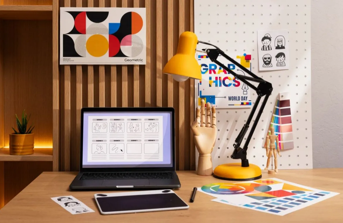
What is Visual Design?
Visual design shapes and enhances a product's aesthetic experience. It creates consistency throughout all visual elements. The discipline does more than make things look attractive, it uses design principles to create meaningful, accessible, and appealing interfaces.
Visual design creates and arranges visual elements that communicate messages and achieve specific purposes. It brings together aesthetics and functionality to craft visually appealing products that improve user experience.
Visual design covers many fields and applications:
- Digital Products: Websites, mobile applications, and software interfaces
- Brand Identity: Logos, color schemes, typography systems, and visual guidelines
- User Interfaces: Interactive elements that help user-product interaction
- Visual Communication: Using imagery to convey information and messages
Also Read: What is Visual Design? The Silent Engine of User Experience
What are Visual Design Principles?
Design principles are the building blocks that guide how visual elements communicate with users. These principles go beyond simple aesthetic rules. They provide frameworks that show how visual techniques shape both perception and cognition of information in any design.
Visual Design Principles
Great design starts with understanding how visual elements combine to create meaningful experiences. These core principles help designers craft interfaces that look great and work well.
1. Balance
Balance creates visual equilibrium by distributing the weight of elements. Picture a “seesaw”, there, ‘balance’ makes sure no single element dominates others. You can achieve this symmetrically, with elements mirroring each other, or asymmetrically, through careful positioning of different elements.
A balanced design feels calm and stable, while imbalanced layouts often create discomfort. The composition needs to feel grounded and pleasing to look at.
Example: Apple’s product pages often place text on one side and crisp product imagery on the other, creating calm, stable symmetry.
2. Contrast
Contrast makes elements pop by playing with differences in colour, value, size, and other attributes. It grabs attention and makes content easier to read.
Red buttons for "Delete" actions in iOS interfaces highlight their importance and what it all means. Beyond visual appeal, contrast ensures buttons and headings catch the eye quickly.
Example: Netflix uses red CTA buttons against dark backgrounds to make actions stand out unmistakably.
3. Alignment
Elements with aligned edges create structure and consistency. This makes content easier to read, groups related items naturally, and builds trust through well-laid-out designs. Users scan aligned content more quickly, which reduces mental effort and creates an accessible interface.
Example: Google’s Material Design guidelines rely heavily on a grid system to maintain precise alignment across components.
4. Hierarchy
Visual hierarchy leads viewers through content based on importance. Users understand what to read first and follow a natural flow. Designers use variations in scale, value, colour, spacing, and placement to achieve this. A lack of clear hierarchy leaves users confused about where to focus.
Example: News websites like BBC or The New York Times use hierarchy to help readers skim thousands of articles effortlessly.
5. Proximity
Elements placed close together naturally seem related, while spaced-apart items feel separate. This helps organise information and show relationships visually. Form fields that appear grouped make scanning easier and feel less overwhelming. The right spacing between elements creates meaningful groups that users understand better.
Example: E-commerce checkout pages group billing, shipping, and payment details into clear sections.
6. Repetition
Using the same colours, fonts, shapes, or layouts builds consistency and reinforces design messages. This creates familiarity and connects elements. Brands that stay consistent see comparatively more revenue. Repetition also creates rhythm and visual flow throughout designs.
Example: Instagram uses consistent icon shapes (heart, comment bubble, paper plane) throughout the app, making the interface instantly recognizable.
7. White Space
White space gives elements room to breathe. It cushions compositions and helps distinguish between elements. Despite its name, this space doesn't need to be white - it's just the area without content. Smart use of white space reduces mental load and helps users focus on key messages instead of clutter.
Example: Google’s homepage uses abundant white space to highlight a single search bar, simple, calm, and user-focused.
8. Unity
Unity brings harmony by making all elements work together. Designers use matching colours, shapes, and textures while balancing positive and negative space.
Visual unity makes designs look cohesive, while conceptual unity delivers the message effectively. No single element should overpower the others in a unified design.
Example: Airbnb’s branding uses soft curves, warm colors, and friendly typography across website, app, and marketing, creating a unified experience.
9. Emphasis
Focal points draw attention to specific elements through size, colour, contrast, or positioning. Without emphasis, users wouldn't know where to look or what's important. The right emphasis creates mental shortcuts that make information stick.
Example: Spotify emphasizes its premium plan CTA with a bold contrasting button that stands out against minimal UI elements.
10. Movement
Movement guides eyes through a design, creating flow and direction. Elements should naturally lead attention between focal points. Designers use leading lines, patterns, contrast, hierarchy, and composition to create movement.
Even static designs need movement to establish hierarchy and tell stories by guiding viewers logically through information.
Example: Magazine spreads use angled photography and large leading lines to guide the reader from headline to subheading to content.
How Top Designers Apply These Principles?
The best designers excel at putting visual design principles into practice. They turn abstract ideas into experiences users love. Their work goes way beyond making things look pretty - they build interfaces that speak clearly and work well.
1. Designing with intent and clarity
Great designers make sure every element has a clear purpose, from tiny icons to the big picture. They set clear goals for users and business needs before they start designing. This thoughtful approach shows the value of keeping things simple by removing anything that might distract users. Yes, it is about more than making things attractive - good design solves problems and creates experiences that matter.
2. Using principles to guide user attention
Smart designers know how to direct where users look through visual hierarchy. They create natural paths for users by arranging elements based on importance. Size, colour, contrast and position help make key information pop out. Users typically scan websites in F-patterns or Z-patterns, and designers use this knowledge to place important elements in the right spots.
3. Creating consistency across platforms
Making designs work smoothly on different devices can be tricky. Most designers build design systems as their guide, with reusable parts and style rules. These systems help pick out the features that need to stay consistent whatever the platform.
This approach will give users a familiar experience whether they're on phone, tablet, or computer, without having to figure out new ways to navigate.
4. Balancing creativity with usability
Finding the right mix of fresh ideas and practical function is always challenging. Smart designers see accessibility and usability as creative opportunities rather than limits.
They test their designs against real-world metrics to make sure creative elements boost the user experience. This balanced mindset creates interfaces that look unique and feel natural to use.
Also Read: The Essential UI UX Design Tools That Top Designers Swear By in 2025
Conclusion
“The life of a designer is a life of fight: fight against the ugliness.” And these principles are the designer’s smartest weapons.
Whether you’re a beginner sketching your first layout or a seasoned creative refining a brand identity, mastering visual design principles is like learning the language of clarity, emotion, and persuasion. Once you speak it fluently, your work stops looking good by chance, it starts looking good on purpose.
Frequently Asked Questions
Q1. What are the key visual design principles every designer should know?
The key visual design principles include balance, contrast, alignment, hierarchy, proximity, repetition, white space, unity, emphasis, and movement. These principles guide designers in creating visually appealing and effective designs that communicate clearly and enhance user experience.
Q2. How does visual design differ from graphic design and UI design?
Visual design focuses on shaping the aesthetic experience of digital products while maintaining consistency across visual elements. It differs from graphic design, which primarily addresses print and static media, and UI design, which concentrates on interactive elements and optimising user journeys. Visual design encompasses the overall aesthetics of a product or brand.
Q3. Why is white space important in visual design?
White space, or negative space, is crucial in visual design as it provides breathing room between elements, reduces cognitive load, and helps users focus on key messages. It enhances readability, creates visual hierarchy, and contributes to a clean, organised layout that improves overall user experience.
Q4. How do top designers balance creativity with usability?
Top designers view accessibility and usability requirements as creative constraints that inspire thoughtful solutions. They test their designs against usability metrics throughout development, ensuring that creative elements enhance rather than hinder the user experience. This balanced approach results in interfaces that are both visually distinctive and intuitively usable.
Q5. What are common mistakes in applying visual design principles?
Common mistakes include overusing contrast or emphasis, which can create chaotic designs; ignoring white space, leading to cluttered layouts; lack of visual hierarchy, causing confusion about important information; and inconsistent alignment or spacing, which disrupts visual flow. Avoiding these pitfalls is crucial for creating effective and user-friendly designs.
About the Author
TalentSprint
TalentSprint, Part of Accenture LearnVantage, is a global leader in building deep expertise across emerging technologies, leadership, and management areas. With over 15 years of education excellence, TalentSprint designs and delivers high-impact, outcome-driven learning solutions for individuals, institutions, and enterprises. TalentSprint partners with leading enterprises and top-tier academic institutions to co-create industry-relevant learning experiences that drive measurable learning outcomes at scale.
Advance your career with the right program
Related articles

Innovation
AI Graphic Design in 2026
Design teams in 2026 aren’t short on ideas, they’re short on time. With more content to create and faster turnarounds expected, the real challenge is keeping creativity intact at scale.
AI ha

Innovation
Visual Design vs Graphic Design: Difference
In a world where every scroll, click and swipe competes for attention, design becomes the silent storyteller behind every digital moment. Yet many people confuse two

Innovation
The Essential UI UX Design Tools That Top Designers Swear By
Back in the early 2000s, designers often relied on pen, paper, and a handful of clunky software to bring their ideas to life. Fast forward